Top 10 MOST BEAUTIFUL movie SHOTS
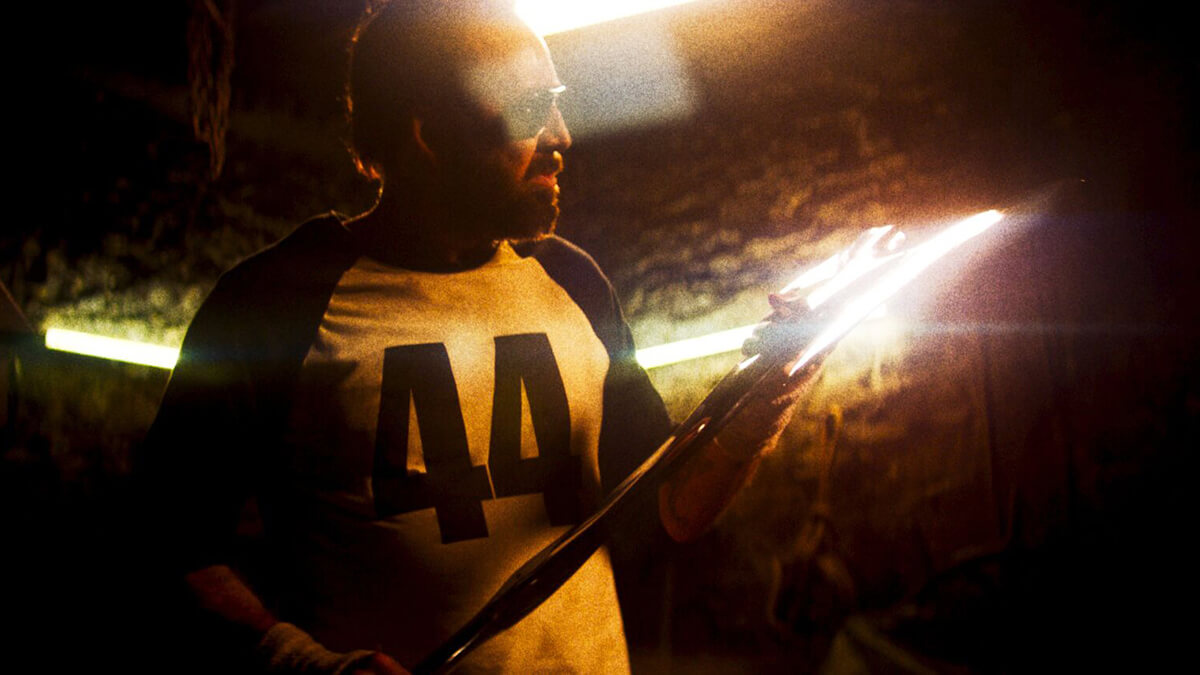
This year marks six years since I’ve been professionally involved in photography, mostly reportage, which I’ve specialized in, and to a slightly lesser extent portrait and session photography. You’re probably wondering why I started this article with information that sounds a bit like me bragging unasked that I’m studying law or that I walrus. Well, photography and film have a lot in common. What a discovery! – you will say, and of course you are right. But this self-evident truth reached me all the more bluntly the more, after three decades spent in the world of film, I delved into the world of photography. So, discarding the sound layer from the film and the continuity of the movement of the camera or the characters captured in the frame, we are left with a static, single image, in a word – photography. Below image from Mandy (2018), directed by Panos Cosmatos, cinematography by Benjamin Loeb.
Like a photographer, a cinematographer, when creating static shots, usually sticks to the iron rules of framing and composition of the frame or creatively breaks them, but always keeps in mind the principle of the triple division, the golden spiral (visible in the above frame from Paul Anderson’s Oscar-winning cinematography There Will Be Blood) and the golden hour (Terrence Malick’s Oscar-winning cinematography Heavenly Days was shot entirely at this time of day). In film, it is much easier to convey the spectrum and continuity of human emotions, the dynamism and impact of action scenes, the panoramic beauty of the landscape. This is because the director and cinematographer are not limited by a single frame; they have 24 of them at their disposal per second, hundreds per minute and thousands per hour.

The camera can remain in constant motion, panning, zooming, raids, departures, change framing, and thus better and more fully (longer) create on-screen emotions and build moods. The photographer has only the Bressonian decisive moment in his arsenal. He must press the shutter button at that one, right moment. A second before or a second after – and it’s over the competition, it’s no longer there, the magic of the moment, the unmistakable fine nuance, the unmistakable magical look, the fleeting emotion has escaped and is sometimes (in reportage almost always) no longer repeatable.

The element common to photography and film, therefore, are single, static shots, which are also fortunately not lacking in the creations of the X muse. These are shots created to arouse admiration, experience and interpretation, devoid of editing and camera movement (or limiting this movement to a minimum), often freezing life like a photograph and, just like it, precisely framed, composed with attention to the smallest details, built of matching elements and beautiful colors.

Like a silent picture, single shots are contemplative, atmospheric and buttoned down to the perfectionism of the director and camera operator. They are often the film’s calling cards, conveying a whole spectrum of information, impressions and emotions to the audience. Speaking for themselves, essential, as if detached from the whole film work, they remain in the memory of viewers as single, beautiful images, like the best photographs taken at the decisive moment, small masterpieces ready to be printed and hung on the wall, like the best canvas of a great master.

Each photographer has his own sense of aesthetics, his own style, his own sensibility, and his pictures have a character that often reflects what the photographer feels in his soul. I, for example, love to catch emotions on people’s faces, capture interactions between the characters in the photo, where looks and eyes play a key role – it’s no coincidence that in a portrait the focus is always on them. I try to take care of the said decisive moment, the best possible framing and the overall aesthetics of the frame. I love symmetry, working against the sun and in all sorts of other types of control light; the more the figure is bathed in light, the better, especially when smoke or fog still enters the frame. I often convert photos to B&W to bring out the emotion even better and focus the viewer’s eye more precisely on the main subject of a given photograph.

This, by the way, is another feature that photography and film have in common; you will admit that black-and-white works of the X muse, by limiting the color scheme of the image to black and white only, focus the viewer’s attention all the more on the acting and the plot. I even happened to create successful photographs with the so-called selective color, nowadays generally considered trash and kitsch, used several years back in wedding photography. But since the greatest, such as Spielberg in Shindler’s List or Akira Kurosawa in Heaven and Hell, used selective color to great dramatic effect, it means that if you do it with an idea, you can from time to time.

I very often work with the narrow focal lengths offered by telephoto and super-telephoto lenses; the closer to 200 millimeters (and tighter), the better, the blurrier the background becomes from the main subject, further narrowing the perspective and often creating beautiful bokeh, especially when there are single light sources in the background. At the same time, I’m equally keen on wide-angle lenses, such as 14 millimeters, and occasionally, in certain situations, I also use fisheye, considered by some photographers to be as kitschy as the aforementioned selective color, because it too deforms reality.

What I don’t like at all is the 24-70 mm zoom range, widely considered to be the most versatile; for me, 24 mm is not enough for a decent wide angle, and 70 mm is just a modest start for a telephoto lens. Instead of lugging around a 2.8-light block weighing 1.5 kilograms, I prefer to use a fixed lens with a universal focal length of 35 mm and a light of 1.4. Yes, I know I’ve drifted off heavily into the technological nuances of photography, I’m already coming back down to earth and moving on to the last paragraph of this lengthy introduction.

Why all the above argument anyway, and why should my photographic passion matter to you? I think that the briefly described characteristics of the determinants of my style of photography translate directly into my chosen TOP 10 MOST BEAUTIFUL FILM SHOTS. Looking the other way, it is probably all these beautiful shots and thousands of watched (those good in terms of pictures) films that taught me (unconsciously) the difficult art of subjective perception of the world through the camera viewfinder and shaped me, in effect, as a photographer.

I now invite you to take a short journey through the magic of the film frame, where the image freezes for a moment, creating an unforgettable moment…
Related:
Ran (1985), dir. Akira Kurosawa
Cinematography by: Takao Saitô, Shôji Ueda, Asakazu Nakai

Watching Ran, all full of beautiful framing, by the way, I even rubbed my eyes in amazement and delight when I saw the above shot. The dense smoke, the fire in the upper part of the building, the symmetrically spaced troops with yellow and red flags, and the centrally placed burning building with the white silhouette of a defeated man descending the stairs – a composition brilliant in its simplicity and how pleasing to the eye with fantastic colors. The Oscar-nominated cinematography of Ran lost out to Out of Africa.
Ivanovo Detstvo (1962), dir. Andriej Tarkowski
Cinematography by: Vadim Yusov
The most modest and intimate shot in my list of the most beautiful ones comes from one of the first films of the master of X muse Andrei Tarkovsky. I can’t quite explain what captivated me so much about this very simple frame, where one of the soldiers carrying a nurse over a trench unexpectedly freezes in place and kisses the girl, all filmed with a camera embedded in a trench. There’s a kind of brilliant simplicity to it, a poetic metaphor for the fleeting nature of the moment, as it’s just a brief pause in the wartime turmoil surrounding the characters. Vadim Yusov, who in subsequent years worked with Tarkovsky on Andrei Rublev and Solaris, among others – in my opinion the weakest film, also in terms of cinematography, in the director’s oeuvre – was responsible for the film’s cinematography.

I’m not the only one who was colossally impressed by the short shot-pearl from Ivan’s Childhood, since in the 2019 Russian Avanpost, nearly 60 years after the release of Andrei Tarkovsky’s film, modern filmmakers pay homage to it, copying it almost verbatim – almost, because without the kiss.
The Shining (1980), dir. Stanley Kubrick
Cinematography by: John Alcott

The exquisitely beautiful opening shot of the scariest horror film mother Earth has ever worn would probably have done equally well as an illustration for a nature film about mountains. However, Wendy Carlos’ hair-raising musical theme made this idyllic vista forever associated with horror and the quintessential Kubrick style, with its love of symmetry and perfection of framing. The Shining, replete with John Alcott’s capital shots and groundbreaking use of steadycam, didn’t even get an Oscar nomination, and in 1981 the Academy Award for Best Cinematography went to Geoffrey Unsworth and Ghislain Cloquet for Tess.
The Favourite (2018), dir. Giorgos Lanthimos
Cinematography by: Robbie Ryan

These cinematography favorites are a rarity, for the film was shot almost entirely with wide-angle lenses and fisheye, which, as I wrote in the introduction, is used in cinema productions from the big bell. Meanwhile, the characteristic distorted (fisheye has a 180-degree angle of view) perspective curving the edges of the frame recurs in Giorgos Lanthimos’ film every few shots, either taking over or handing over the baton to traditional wide-angle glass. It must be said that such a method of imaging worked perfectly for a period film, full of high, spacious palace rooms and vast landscapes. The wide angle was also filmed, of course, in the above opening scene, depicting one of the central characters of the drama. Excellent frame composition, counter light from the windows (with a surge, but deliberate), and, well, that cape taking center stage in the frame. This phenomenal shot sat in my head throughout the screening. The Oscar race for the Best Cinematography award favored lost to Alfonso Cuarón’s Roma.
The House That Jack Built (2018), dir. Lars Von Trier
Cinematography by: Manuel Alberto Claro

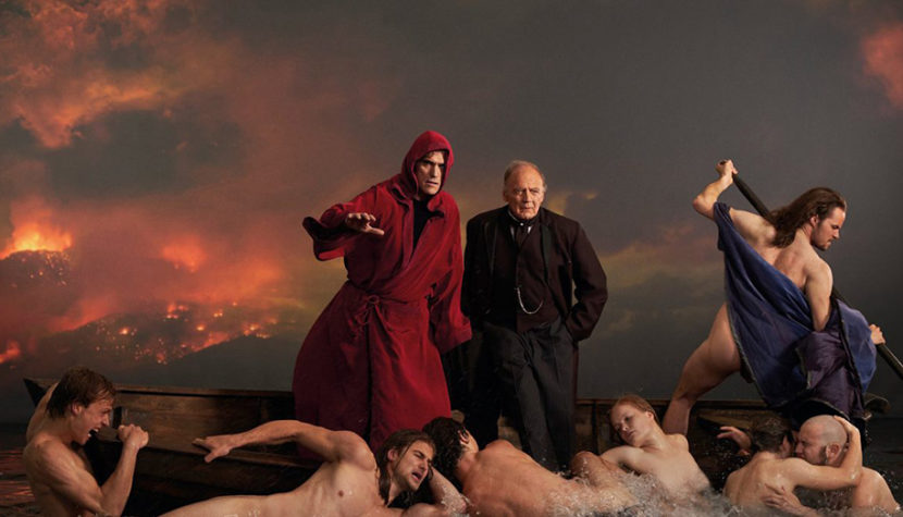
If there were an Oscar category for the best single shot, the above frame from Lars Von Trier’s film should not only get the 2019 Golden Knight, but also a special award for the most beautiful… I don’t know, shot of the decade? Whatever one may say about The House That Jack Built, that it’s controversial, unnecessarily and overly violent, that Lars Von Trier ended up with Kill ‘Em All… (I got caught up), the slow motion shot depicting the trek through hell is a small work of art and, for me, one of the most beautiful color palettes I’ve seen in cinema in general. The shot above is a cinematic variation on Eugène Delacroix’s 1822 painting Dante’s Barge, depicting Dante and Virgil wandering through hell; Lars Von Trier has inserted a red-robed Jack in place of Dante. And below is the said painting of Dante’s Barge.

Twin Peaks (2017), dir. David Lynch
Cinematography by: Peter Deming

There have been several attempts in the history of the X muse to credibly portray a thermonuclear explosion. The robotic work of James Cameron’s team in Terminator 2 was impressive, the nuclear explosion was miraculously avoided by John Connor in Terminator: Salvation, the unmitigated annihilation of humanity was seen in the prologue of Terminator: Genisys, and Steven Spielberg also presented his vision of a giant mushroom in the fourth installment of Indiana Jones’ adventures. And while all of the above explosions were quite impressive (Indy in the refrigerator less so), in 2017 David Lynch came along with his court cinematographer Peter Deming (Evil Dead II, Lost Highway, The Cabin in the Woods) and literally swept away the competition with his brilliant cinematography for the third season of Twin Peaks. The icing on the cake remains the above frame, the only computer-generated one in this compilation, but I couldn’t resist highlighting it here. Here we have a slow camera raid on the growing atomic mushroom, beautiful contrasts between the brightness of the explosion and the spreading darkness of smoke and dust, a wonderful play of chiaroscuro, and all this in black and white, which, by stripping the red-orange fire of the explosion of its color, paradoxically added a dose of indefinable horror, mystery and anxiety to the terrifying spectacle. An excellent example of how creatively applied CGI can still be breathtaking.
Stalker (1979), dir. Andriej Tarkowski
Cinematography by: Aleksandr Knyazhinskiy

Andrei Tarkovsky’s cinema, like the works of Stanley Kubrick, is characterized by thoughtful and polished frames. One could go on for a long time listing unforgettable and amazing shots from Tarkovsky’s films such as The Mirror, Nostalghia, Andrei Rublev and The Sacrifice. In 2020 I went through the entire filmography of the Soviet master of cinema from cover to cover, recalling some films, watching others for the first time (Ivan’s Childhood, Nostalghia, Andrei Rublev), and I remain very impressed with most of the titles. Only Solaris, which is, in my opinion, the least… Tarkovsky-like, did not excite me. Returning to the subject, i.e. the most beautiful shots, the best representative of the brilliant eye of the director and cinematographer Alexander Knyazhinskiy is the above shot from Stalker, for me the most beautifully photographed film of all the titles from the master’s filmography. The play of chiaroscuro on the disturbingly shaped piles of sand, the central framing and the three figures placed in the center – simple, yet so beautiful! Even without knowing the enigmatic plot of Stalker, everyone will conclude that from this frame emanates eeriness and an unfathomable mystery lurking somewhere off the screen. It is interesting to note that as many as three cinematographers worked on Stalker, but the cinematography taken in 1977 by Georgy Rerberg was mostly destroyed (although, as rumor has it, it was Tarkovsky himself, dissatisfied with the effect, who was said to have destroyed the tapes), and Leonid Kalashnikov, who was hired to replace Rerberg, was not even mentioned in the credits.
Blade Runner 2049 (2017), dir. Denis Villeneuve
Cinematography by: Roger Deakins

I fell in love with this frame the moment I saw it on one of the first teaser images of Blade Runner 2049, and from that moment on I was at ease with the sequel to my beloved 1982 classic. The figure of the main character is hidden in shadow, and the contours of his silhouette are drawn by the lights of futuristic vehicles falling from behind. Although we can’t see the antagonist’s face, it’s clear that he’s the titular hunter, evidenced by his 3/4 coat and high, stand-up collar. Associations with Rick Deckard’s outfit from the original Blade Runner come to mind. I appreciate Roger Deakins’ cinematography from such films as No Country for Old Men, Road to Perdition, Sicario (here especially!) and many others, but his work on BR2049, where he climbed to the heights of his artistry, impressed me the most, well, and brought Deakins (after 13 nominations!) the coveted Oscar. Well, okay, I admit that I was wrestling with my thoughts as to whether I liked the above more, or the following, which is a minimalist take, equally wonderful in its simplicity.

Barry Lyndon (1975), dir. Stanley Kubrick
Cinematography by: John Alcott

Stanley Kubrick wanted his Barry Lyndon to resemble 18th-century paintings. The director and cinematographer John Alcott were inspired by the paintings of Thomas Gainsborough and William Hogarth. The film, which deservedly won an Oscar for its cinematography, was shot entirely with natural light, made possible by the use of extremely bright lenses created for… NASA. And although of Barry Lyndon the most memorable are the famous card game scenes lit only by candle flames, one should not forget the wonderfully beautiful outdoor shots, those in palace interiors, and the beautifully composed sequence of the duel between the title character and Lord Bullingdon. But you’ll admit for yourselves that the above shot of Barry, sleeping in the company of party attendees as tired as he is, is the most beautiful, most painterly frame from the historical fresco by the creator of A Clockwork Orange. Beautiful, vivid colors, meticulously planned seating of the shot’s characters, composition according to the golden spiral principle, and, well, that amazing sidelight coming through the window. The whole thing looks like it was taken alive from an 18th century painting. And not surprisingly, after all, the inspiration for this particular shot was a painting by the aforementioned William Hogarth entitled The Tête à Tête.

Blade Runner (1982), dir. Ridley Scott
Cinematography by: Jordan Cronenweth

The juxtaposition closes with perhaps the most beautiful detail in the history of cinema (only a close-up of the ring on Sauron’s paw can compete here), the shot of the eye filling the entire frame, from the opening of my beloved Blade Runner. The eye sharpening I mentioned in the introduction takes on a whole new meaning here! The close-up of the camera bordering on exaggeration, reflected in the pupil of the light of Los Angeles A.D. 2019 and the fire bursting from the chimneys is a small masterpiece, one of the most characteristic frames in the history of cinema and – for me – a visual showcase of a cult classic, or if you prefer Ridley Scott’s cult classic, full of equally beautiful shots at every turn. The absence of even an Oscar nomination for Jordan Cronenweth’s (Altered States, State of Grace) brilliant cinematography is one of the biggest blunders of the Academy of Motion Picture Arts and Sciences. That year’s Academy Award for cinematography went to Gandhi, while the honor of nomination went to E.T., Das Boot and Sophie’s Choice and Tootsie, among others. While the cinematography for Das Boot really gave it a go, and one of the shots from E.T. has become iconic, someone please point me to equally memorable, iconic, beautiful shots in Sophie’s Choice, Tootsie or Gandhi.


