SECRETS Behind FILM STUDIO Opening LOGOS

For quite a few years now, occasional reworks of the film studio opening logos of the largest film giants have been in vogue. But few people know that some of them are a peculiar form of entertainment filled with hidden meanings. What kind of meanings? The answer is below.
Bad Robot
Let’s start with one of the most distinctive images. J.J. Abrams’ creation is a relatively young company, boasting an extremely eccentric opening logo that, like a short film in its own right, reveals its full meaning only after some time. It was created in 2001 and first appeared on… the small screen, concluding episodes of the ABC series Alias. Due to its television roots, it was initially much shorter than the version we know today. Additionally, it was accompanied by a synthesized voice exclaiming “Bad Robot!” This voice belongs to Abrams’ children, and the director came up with this peculiar, seemingly unrelated-to-film idea during one of his creative meetings. Well, why not?
Columbia
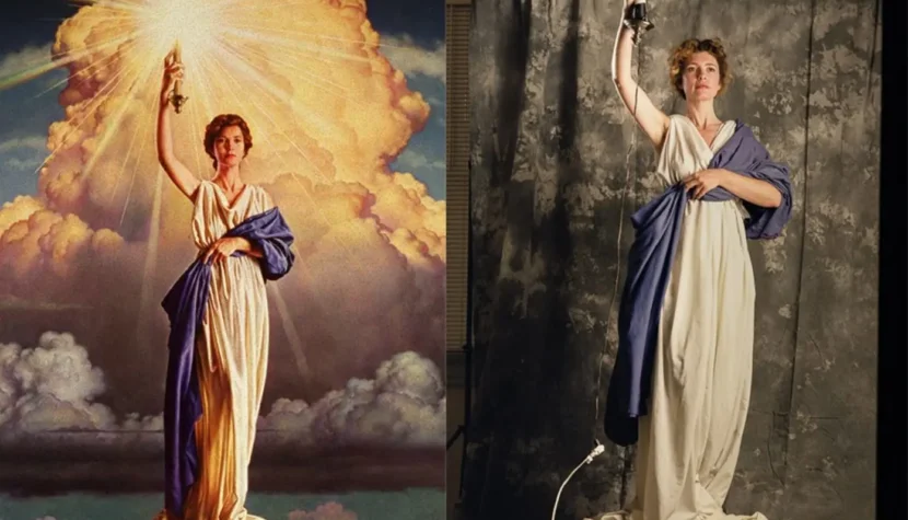
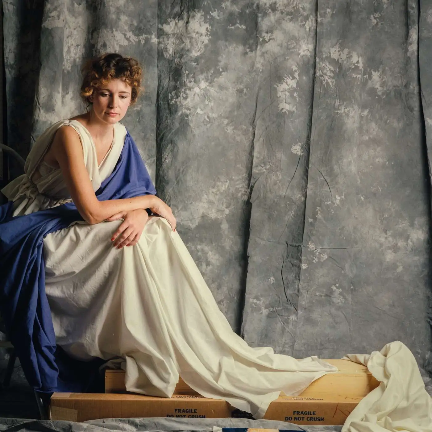
It’s more than 100 years since brothers Harry and Jack Cohn, along with their friend Joe Brandt, launched CBC Film Sales Corporation, the precursor to Columbia Pictures, founded six years later. The studio’s name, as well as its unforgettable symbol of a woman with a torch, directly reference one of the mythical figures from the formative period of the United States – the so-called Lady Columbia. She is literally the female personification of the U.S. and one of the icons of the country’s fight for independence. She has continuously represented the studio since its inception, adapting her appearance to changing times – for example, replacing the American flag, which she originally wore, with plain robes. The most well-known and current incarnation of her face, created in 1992, was modeled by Jenny Joseph, a graphic designer from New Orleans. A timeless icon of the cinematic world.

Disney
Contrary to what the House of Mickey Mouse has accustomed us to over the past decades, the castle did not always adorn films from this studio. The logo, inseparably associated with Disney (and Disneyland) and accompanied by the melody When You Wish Upon a Star, was introduced to the world only in 1985 with the release of The Black Cauldron. Previously, the studio’s productions were preceded by the simple text: “Walt Disney presents.” Presumably, the change was a result of the immense popularity of Disney’s theme parks, a success that the studio’s management wanted to replicate in its then-struggling cinematic division. And it worked – Disney’s golden streak in the film market has been thriving ever since.
DreamWorks
The birth of another family film powerhouse dates back to the mid-1990s, when Steven Spielberg, Jeffrey Katzenberg, and David Geffen – whose surnames form the SKG abbreviation beneath the studio’s name – joined forces to create a studio producing both live-action and animated films to compete with other major players. Allegedly, the image of a man sitting on the moon with a fishing rod came to Spielberg in a dream, symbolizing the spirit of Golden Age Hollywood. The final design was the work of artist Robert Hunt, who slightly modified the concept by replacing the man with a boy – modeled after his own son. Over time, the opening logo was enhanced with music composed by Spielberg’s long-time collaborator, John Williams. Notably, only the “S” from SKG remains today, as Geffen has retired and Katzenberg has ventured into his own business.
Legendary
This company, which has just reached adulthood, is one of the many newcomers on the American landscape. Over 18 years, billionaire Thomas Tull’s venture has built a strong reputation. Films released under this banner, such as 300 or the Dark Knight trilogy, clearly aim to be legends of their generation. It’s no surprise that the studio’s logo shares this legendary theme. It is a variation of a Celtic knot – a closed interlace with no beginning or end. Originating in Ireland as early as 5000 BC, these knots symbolize unity, security, and eternity.
MGM
Every cinephile (probably) knows that these three letters stand for Metro-Goldwyn-Mayer, the names of the producers who founded the company in 1924. The Latin inscription on the golden film reel, “Ars gratia artis,” translates to “Art for art’s sake.” The slogan was created by the designer of the logo, Howard Dietz, as a nod to his alma mater, Columbia University, whose mascot is also a lion. The roaring beast, MGM’s hallmark since 1928, was not a new invention, as it was previously used by Goldwyn Pictures, later one-third of MGM. Over the years, the logo evolved, and the lions often differed. The canonical lion, known as Leo, has been seen on the big screen since 1957. To enhance its roar, however, the sound was a mix of several wild cats. And it works.
Miramax
Jokes about Harvey Weinstein aside – the company formed by him and his brother in the late 1970s is one of the most important young studios and a significant American distributor. Initially represented by a bold, intimidating “M” on the screen, it later adopted a friendlier typeface against the nighttime Manhattan skyline (despite being founded in Buffalo). But what does the name mean? It’s a creative combination of the Weinstein parents’ names – Miriam and Max. A true family business.
Paramount
This is the oldest studio still operating in Hollywood (Universal is older but is located in the San Fernando Valley). Paramount was born 106 years ago from the merger of smaller studios and has remained a giant in the American dream factory ever since. Its logo, featuring a distinctive mountain, has become one of the industry’s most recognizable symbols. The stars circling the peak represent the original 22 film stars contracted by the studio, though the number varied over time. The mountain itself was inspired by W.W. Hodkinson’s memories of Utah’s Wasatch Range, which he often admired. Truly majestic.
Pixar
Like Miramax, Pixar’s roots trace back to the 1970s when George Lucas began exploring computer technology. Pixar, as a company, was born in 1986, thanks to Steve Jobs, who acquired Lucas’s computer graphics division. The name comes from a computer developed by Lucas’s team for digital animation. The iconic lamp jumping among the letters before each Pixar film is the protagonist of the studio’s first short film, Luxo Jr., created the same year by John Lasseter. The lamp was modeled after Lasseter’s desk companion, the Luxo L-1, designed by Norwegian Jac Jacobsen in 1937 and sold until 2017. A beautiful story.
TriStar
In 1982, CBS, HBO, and Columbia joined forces to reduce rising production costs, creating TriStar. Two years later, the project gained its emblem – a winged horse. Victor Kaufman, the founder, and an avid horse enthusiast, proposed the idea. The first image of the galloping horse was borrowed from Sydney Pollack’s The Electric Horseman, a Columbia production. In 1993, before the release of Sleepless in Seattle, the logo was refreshed, featuring Hawaiian-recorded clouds and replacing the horse with a fully digital one. A sign of the times.
Bonus: Se-ma-for

As a final touch, something from Poland. This Łódź-based animation studio has a rather peculiar name, seemingly referencing railway signaling. Could it be due to its proximity to the railway? Possibly, but in reality, it’s a catchy abbreviation for Studio Małych Form Filmowych (Studio of Small Film Forms), whose origins date back to the late 1940s. Today’s Se-ma-for continues this tradition. May it last as long as possible.

